Financial reporting has gone beyond ledgers and spreadsheets. Today’s financial reporting software programs use detailed visualization methods for effective and efficient reporting. Here’s how data visualization is being used in financial planning and analysis (FP&A).
The Importance of Data Visualization in Financial Reporting
The purpose of financial planning and analysis reports is to summarize data in ways that can be meaningfully used and enacted upon. Visualizations are some of the best ways to do this, as they’re able to summarize financial analytics in ways that users can quickly digest.
The right visualizations can help with screening financial data, identifying trends, checking outliers, recognizing patterns, and general analytics. All of these may not be immediately clear without a visualization — and some would likely never be seen if it weren’t for a chart or image.
It’s said that a picture is worth a thousand words. A good visualization is (literally) worth a thousand data points.
The Need for Data Visualization Today
Visualization has always been important in financial planning and analysis, but it’s especially so in today’s business world. Stakeholders and decision makers need quick ways to assess data, so they can efficiently hone in on the most informative information.
Including visualizations in FP&A reports is perhaps the best way to help users identify, analyze and act on the information they need.
Common FP&A Visualizations Used Today
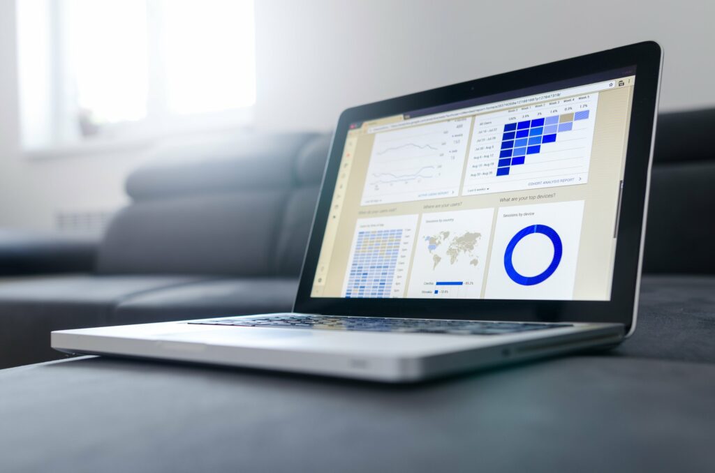
Financial planning and analysis visualizations have evolved far beyond the simple charts of early spreadsheet software programs, but those still remain helpful too. The visualizations used in FP&A today include a combination of the new and old:
- Charts and Graphs: Line charts, bar charts and pie charts all remain excellent ways to communicate basic data in a clear way. FP&A software now also makes it easier to generate area charts, Gantt charts, wedge stack graphs, streamgraphs, and other more visually complex charts and graphs.
- Tables: Tables remain useful when specific data points need to be reviewed. The basics of a text or numerical table haven’t changed much, but automatic highlighting makes it much easier to find the most important boxes.
- Maps: Dot distribution maps, heat maps and tree maps are all more common thanks to more robust financial reporting software. These make seeing distributions and relationships easier than simple charts, graphs and tables.
- Plots: Visualize pot methods, like box-and-whisker plots and scatter plots, to show data in a more detailed way, while still being easy to digest.
Of course, there are many other ways to visualize financial reports. Most FP&A visualizations can be made by customizing one of these, however.
Dashboards Make Financial Visualizations Accessible
Perhaps the greatest leap in financial planning and analysis visualization is the simple dashboard. Dashboards make data accessible.
First, dashboards display the most pertinent information for users. The visualizations shown on an FP&A dashboard can be customized to an individual’s role within the business, showing them the information that they specifically need most. With more robust FP&A software, users can also use artificial intelligence to create a dynamic dashboard that switches out visualizations based on what data has been gathered.
Second, dashboards provide quick access to more detailed views of the visualizations that they show. Users can usually just click on a visualization, and then see it in more detail, further adjust its parameters, or analyze a specific aspect.
Best Practices in Financial Data Visualizations
Creating effective financial visualizations involves more than just choosing the right chart type. Visualizations are most beneficial when businesses follow these best practices:
- Simplicity: Focus on clarity and conciseness, as the purpose is to make data easily digestible.
- Type: It’s important to select the best type of visualization, depending on the data and needed information.
- Scales and Units: Ensure uniformity in scales and units for accuracy and comparability.
- Contextual Elements: Include options to easily overlay benchmarks, historical data and other contextualizations, for a richer perspective.
- Interactive: Digital visualizations should be interactive, so users can quickly access drill-down as they need to.
Combining Data Visualization with Financial Analytics
Data visualization has become a vital complement to financial analysis. Integrating visualizations into analysis provides a faster and fuller understanding, improving analysis in multiple ways:
- Enhanced Analytical Insight: By visualizing financial data, complex analytical findings are easier to identify. This includes trends, patterns, and correlations that might go unnoticed in raw data formats.
- Real-time Data Analysis: Modern visualization tools can handle live data feeds, allowing for real-time financial analysis. This capability is crucial for timely decision-making.
- Predictive Analysis and Forecasting: Advanced visualization tools can integrate predictive analytics, providing forward-looking insights such as revenue projections and risk assessments.
Get the Right FP&A Visualizations for Your Business
To better empower your business’s decision makers with the financial information they need, make sure you’re using FP&A software with powerful visualizations and analytics. Contact us, to learn more about how we can leverage data visualization for your business’s financial decisions.